I decided to view more of the last creator's work and this one is slightly stiffer in terms of the movement of the figures,and the special effects feel a bit excessive. The timing is still well done and it feels like I'm watching something that is alive rather than inanimate, but there was some overkill in post.
Thursday, May 1, 2014
Zelda Stop Motion - Figma Link and Black Rock Shooter 薩爾達傳說停格動畫
This stop motion is amazingly well done. The figures move in a fluid fashion that makes their motions seem alive. There are a ton of special effects but in this video it adds on rather than makes it feel cheesy.
Stop Motion Pizza short version
http://vimeo.com/84949689
This is much better, all of the excess was cut out and it made the video much easier to watch. I still feel that there needs to be an ending where maybe someone has the little pizza delivered to them to bring the journey to an end rather than it just fading out. Also the pizza could be a lot better looking. I know it's only an miniature pizza but i would not eat that.
This is much better, all of the excess was cut out and it made the video much easier to watch. I still feel that there needs to be an ending where maybe someone has the little pizza delivered to them to bring the journey to an end rather than it just fading out. Also the pizza could be a lot better looking. I know it's only an miniature pizza but i would not eat that.
stop motion pizza
This was really interesting at first and the frames are very well thought out, yet some of the segments are way too drawn out. There is a short version of this video that I plan on watching because as it stands right now the segment where the "pizza" is being taken around the city is drawn out way too long; to the point even where I'm very aware of the music loop because I'm become bored.
Tuesday, April 29, 2014
Audio Soon

Japanese CD?
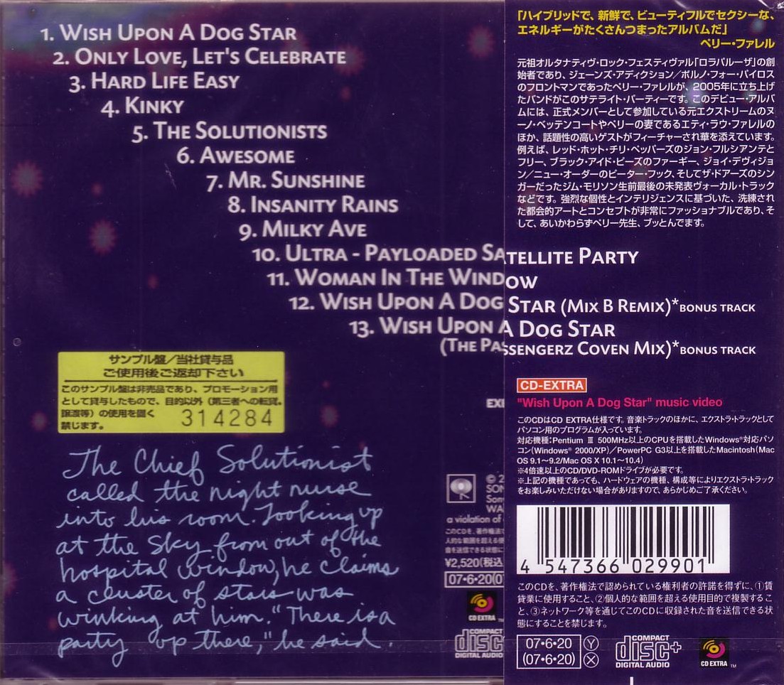
Yamaha CD

The background for this one is really clean and brings life to the rest of the images and text. Everything feels organized and there's open space without the piece feeling too empty or cluttered. Good use of typography and organization.
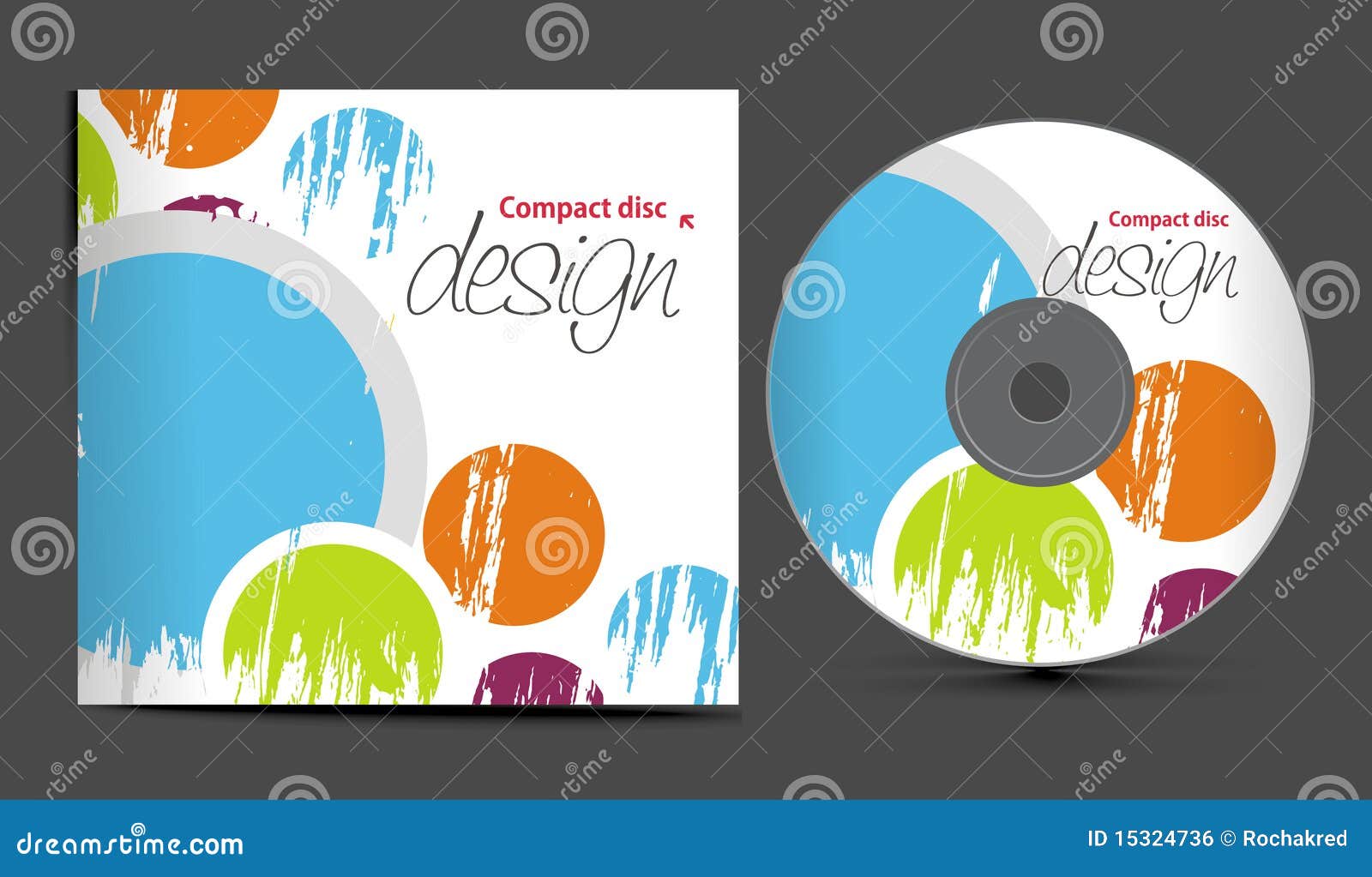
Sample CD
http://edharpphotos.homestead.com/cd-cover-sample.jpg
Okay I get it this is a wedding photo album on a CD but it could use more typography rather than just the centered text that says their names and then the big disclaimer that is totally going to persuade people not to print these pictures on their own. It's just very bland and needs a lot more elements to make it as visually interesting as the photos that are on the CD should be.
Tuesday, April 22, 2014
Sample CD
Centered CD

Sample CD

Tuesday, April 8, 2014
Kiosks for convenience store food

CMC Kiosk

Saturday, March 22, 2014
Retail Store Interactive Kiosk
It's pretty cool that people going to a store to look for clothing could get a bit of that online shopping feel before actually stepping into the store; however, I'm not crazy about the idea that it would try to guess what size and relevant stuff to you. What would be cool instead is that ability to search specific size items as you would online. The ability to see the item tags on a map of the store is really helpful in finding what you need. This is a really advanced system (as they said it needs an i7 processor) but it shows how far you could really go with interactive kiosks.
Smart Digital Retail Kiosk
The user interface of this kiosk or at least the version being demoed here seems to be marketed towards people buying stuff for a super bowl party. Now ignoring this aspect this works as a very simple digital recipe book based on a shopping list that you scan in with a QR code. It seems to respond very well to touch and the pages are formatted to fit on this object meant to look like a clipboard pulling a more traditional feel into the digital.
Tuesday, March 18, 2014
OGLE Kiosk Demo
The interface of the kiosk in this video would be very effective for a school. The overall layout stays the same while the buttons and interactive "body" stays the same. It's actually really reminiscent of web design with how simple and user friendly it is.
TIO :: Flash Kiosk Interface Demo
This is a pretty simple Kiosk for paying bills Much more complex than what we'll be doing in class but still something that should be kept in mind because of its simplicity. A lot of the transitions can be done in flash easily, and the layout is more complex than what I had in mind, but simple enough to be doable.
Thursday, March 6, 2014
Guitar Symphony
Another song that falls into the "I would totally hear this during an epic or climatic moment in a movie" category. This song is a simple loop of the same parts without much variation but it still works because the guitars which change add to the music in the background.
Face to Face Garageband Song
This piece from garageband gives me the feel of a climatic moment in an action filled movie. The orchestra elements repeat throughout the entire piece while there are subtle changes throughout.The levels are nice the audio doesn't become too intense to the point there's clipping so the producer was very careful with his levels.
Thursday, February 6, 2014
UMD Promo.mov
This is very slide show like and that's okay but it's kind of the basic ground idea of still images that just zoom in and out with text spliced over it like some sort of powerpoint. What I need to keep in mind is motion and transition that's not cheesy so project 1 can be the best that it can be.
Tuesday, February 4, 2014
Microsoft stop motion promotional
There are a lot of good ideas here but they get way too jerky in the animation. I think it would be more effective if the segments that are not facing the wall would go back to filming at a tv frame rate. There's a lot of cliche in the graffiti but I like the use of the microsoft logo in the beginning and the end. The repetition of the 'be x' is effective, the font reminds me of cards against humanity but it still works.
UMBC HSC Holi Hungama 2013 (Promo)!!!!
Okay I like the graphics of this one even though it's about a cultural event rather than promoting the college itself.
One thing that I would to see is a stronger connection between the video segments and the text and visuals that were created in after effects. Any difference in color, saturation, and style could jar the person viewing it and take them out of the promo.
Columbus State Community College Commercial
This one is really awkward how it's zooms in on the girl and she just stares at the camera. The announcer has a good voice and tells you what it means to go to college and get an education. I also really like the graphics at the end and the motion sweep of the colors
Very quick and impactive but very awkward for the first 10 seconds
Carroll Community College's latest commercial.
http://www.youtube.com/watch?v=0HABUH0V0sc
Thanks Carroll for being lame and having embedding disabled because you know sharing your video is such a bad thing.
The style of this video is very simple with the cut up words being mixed and matched to describe the different aspects of the college. Now I think they could use the schools colors more and different words because they use better three times instead of buzz words like (thrive, prepare, establish, build, become, advance) that would have a bigger impact on the viewer.
Subscribe to:
Comments (Atom)